
Copywriting Breakdown: $200k+ Ruben Hassid “How To AI” Newsletter
Make money with your funnel today

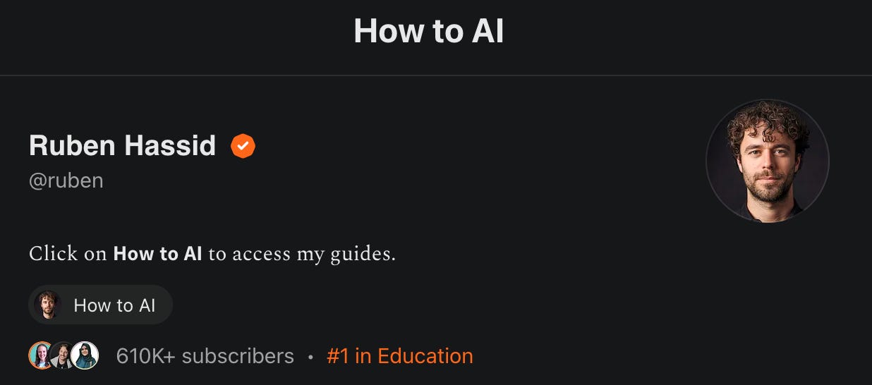
Ruben Hassid ranked #1 in education on Substack
Plus, he has built a 610,000-subscriber AI newsletter
I had to know how he makes $200k+/yr with his Substack newsletter, so I just spent 6 hours going through Ruben’s Substack homepage, his welcome/landing page, and his welcome email, and wow, there’s a lot worth studying here.
Why I chose this example:
He’s one of the fastest-growing AI newsletters in the world, and the funnel that got him there isn’t as polished as you’d expect
His landing page pricing strategy is genuinely unusual — and genuinely smart — and worth stealing
His welcome email has a mechanic in it i’ve never seen anyone else do, and it’s brilliant for one specific reason
Here’s what you’ll learn in this issue:
Why Ruben’s minimalist homepage works against him (and what the one easy fix is)
The sneaky pricing trick that makes his $200/year plan feel like a no-brainer
What his welcome email gets right, what it gets wrong, and why the 3-step onboarding flow is both clever and painful at the same time
Ready?
Grab your goggles, we’re cannonballing into Ruben’s funnel.
Funnel Piece #1: The Website / Substack Homepage
3 things they’re doing well:
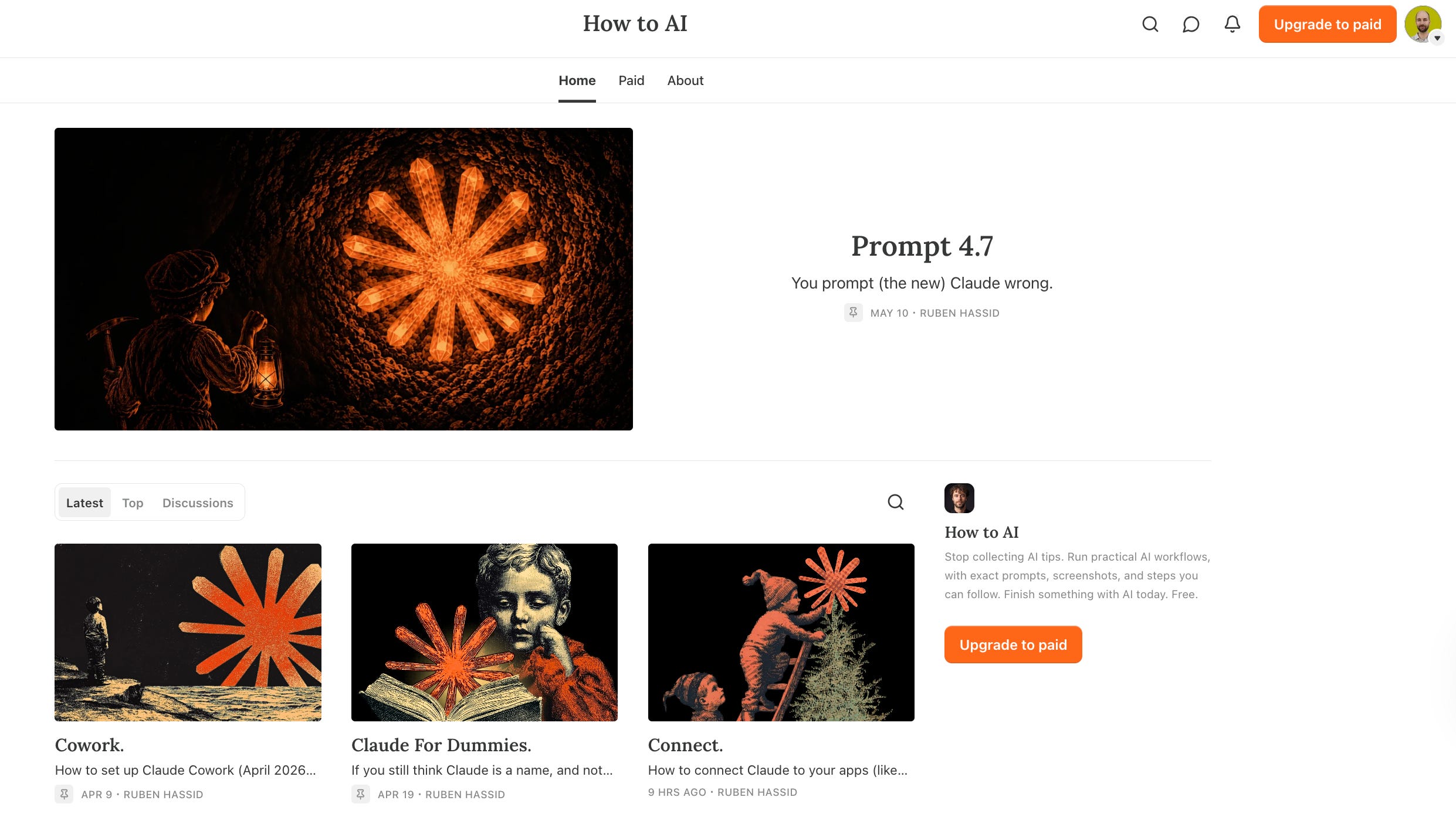
Minimal navigation keeps the focus where it belongs. Ruben’s navigation bar has three items: home, paid, and about. That’s it. When someone lands on this page, there’s nowhere to go but down — which means their attention stays on the posts and the subscribe button. Friction reduction 101. It works because the fewer choices you give someone, the more likely they are to make the one you actually want.
The social proof numbers do the heavy lifting. 610K+ subscribers. #1 in education. Those two data points are sitting right in the substack profile header, and they’re doing exactly what social proof is supposed to do: they answer the silent question every new visitor is asking, which is “is this worth my time?” before they’ve read a single word. Most people don’t read. They scan. Ruben’s scan-readable credibility is hard to beat.
The most popular posts carry real engagement signals. The “top” posts tab shows multiple posts with 500+ likes each. That’s a trust signal. It tells a skeptical new visitor that real humans are reading and responding to this newsletter. It’s the digital equivalent of walking past a restaurant and seeing it full. You don’t need to read the menu to decide it might be worth trying.
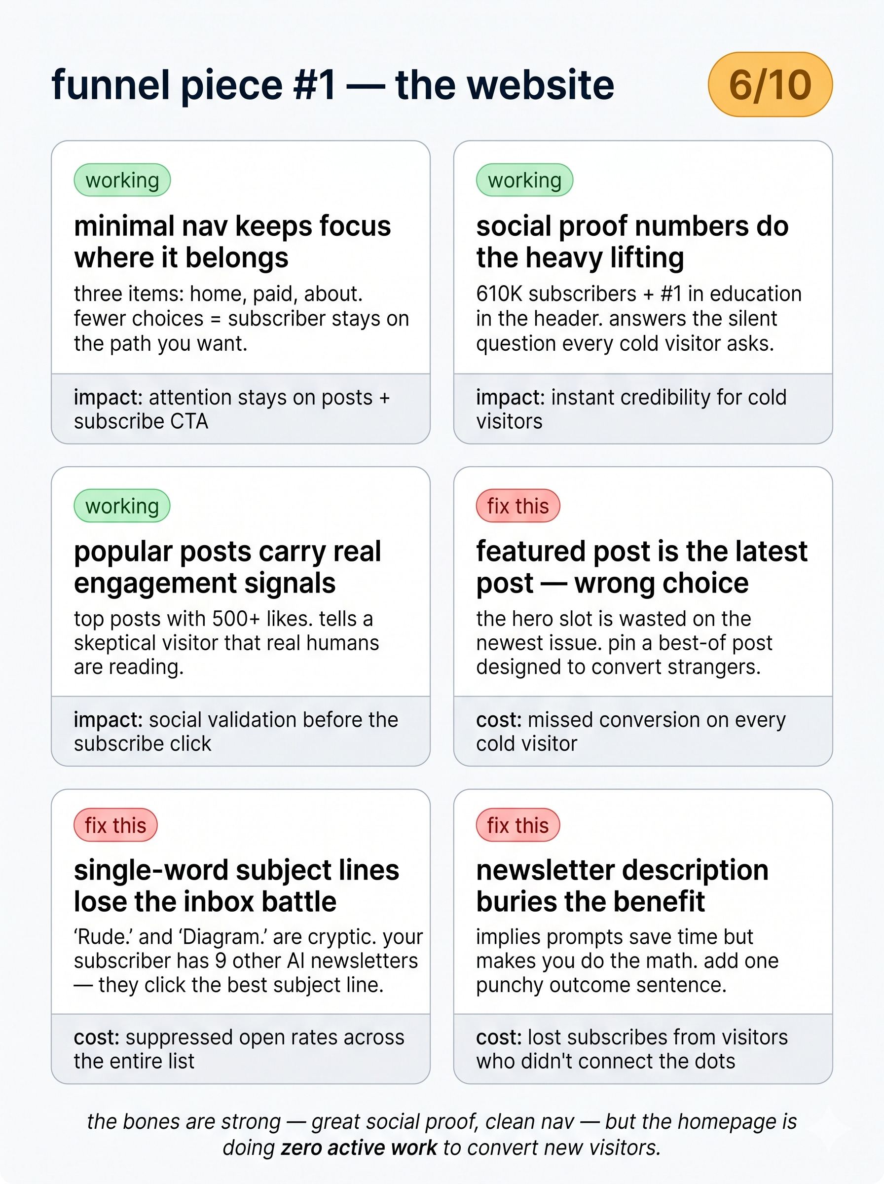
2 potential improvements:
The featured post is whatever was published last — not the best entry point. This is the single biggest missed opportunity on the homepage. The hero slot — the big featured post at the top — is occupied by the most recent issue. To maximize conversions, Ruben should pin a “best of” post or a high-converting entry post that’s specifically designed to convert cold visitors into subscribers. That one swap could meaningfully move his subscription rate without changing anything else.
Single-word subject lines are losing the inbox battle. Posts like “Rude.” and “Diagram.” are stylistically minimal — but minimalism only works when you’re the only email in the room. You’re not. Your subscribers are also getting emails from every other AI creator they follow, and when 10 emails land at the same time, they click the best subject line. Not the most cryptic one. Ruben has 610K subscribers despite these subject lines, not because of them. Imagine what his open rates look like with actual benefit-driven hooks.
Overall score: [5/10]
The bones are strong — great social proof, clean nav — but the homepage is doing zero active work to convert new visitors.
Funnel Piece #2: The Welcome Page / Landing Page
4 things he’s doing well:
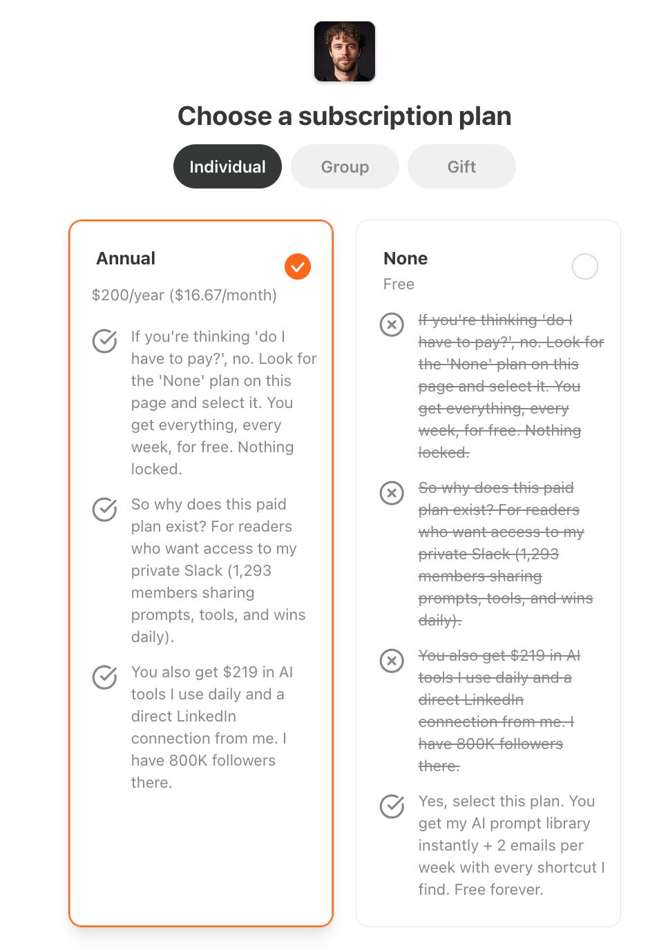
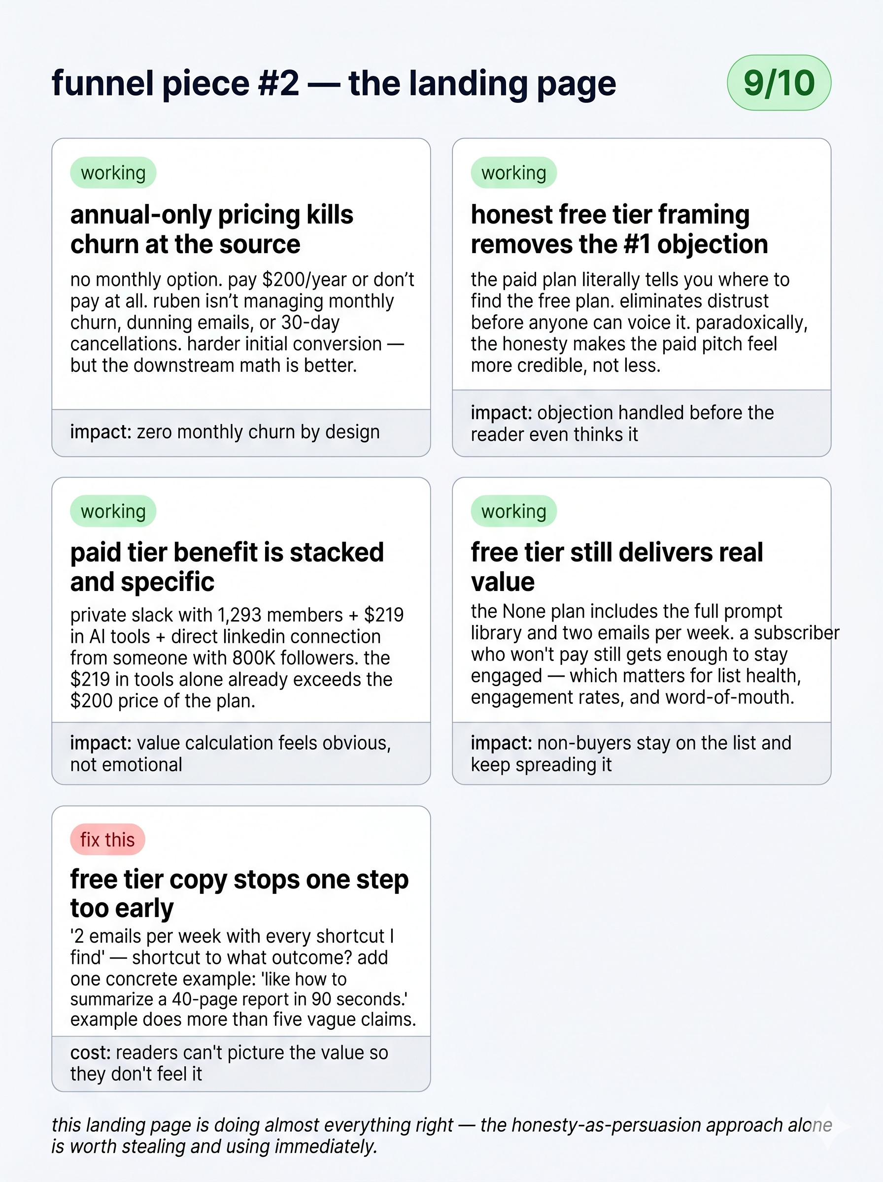
Annual-only pricing eliminates the churn problem at the source. There’s no monthly option. You either pay $200 for the year or you don’t pay at all. This is a bold call because it makes impulse purchases harder — but it also means Ruben isn’t managing monthly churn, dunning emails, or subscribers who cancel after 30 days. For a creator who’s monetizing through community access rather than content, annual-only makes complete sense. The trade-off is real (harder initial conversion) but the downstream math is better.
The free tier framing is honest and effective. Most paywalled newsletters hide the free tier or make it feel like the consolation prize. Ruben’s landing page does the opposite. The annual plan literally says, “if you’re thinking ‘do I have to pay?’ — no. Look for the None plan on this page and select it.” That’s him actively telling you it’s free. Why does this work? because it eliminates the #1 objection before anyone can voice it. It removes distrust from the room. And paradoxically, the honesty makes the paid pitch that follows feel more credible, not less.
The paid tier benefit is stacked and specific. The annual plan lists three things: access to a private Slack with 1,293 members sharing prompts daily, $219 worth of AI tools he uses personally, and a direct LinkedIn connection from someone with 800K followers. The $219 in tools alone is already more than the $200 price of the plan. Ruben doesn’t just say “get exclusive access” — he attaches a concrete dollar value to the offer. That’s a straightforward value calculation that makes the decision feel obvious, not emotional.
The free tier still delivers real value. The None plan isn’t an empty shell. it includes the full prompt library and two emails per week. That’s a real offer. It means a subscriber who can’t or won’t pay still gets enough value to stay engaged — which matters for list health, engagement rates, and word-of-mouth.
1 potential improvement:
The free tier benefit copy stops one step too early. “2 emails per week with every shortcut I find“ — okay, but what kind of shortcut? Shortcuts to what outcome? This is the classic feature-stops-before-the-benefit problem. “Every shortcut I find“ could mean anything. Compare it to something like: “2 emails per week — like how to summarize a 40-page report in 90 seconds, or how to turn a voice note into a LinkedIn post without touching a keyboard.” Now I can picture it. Now I want it. One concrete example in that bullet would do more conversion work than five vague benefit claims.
Overall score: 9/10
This landing page is doing almost everything right — the honesty-as-persuasion approach alone is worth stealing and using immediately
Funnel Piece #3: The Welcome Email
3 things he’s doing well:
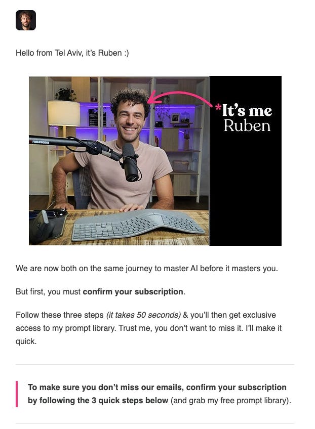
The personal image and visual identity hit the right tone. Ruben opens with his own photo — a warm, real image of him at his desk with a curved ergonomic keyboard, which is a small but effective signal: this guy actually uses the tech he writes about. It’s not a headshot on a white background. It’s a setup. It says, “I live in this world, and you’re going to live here too.”
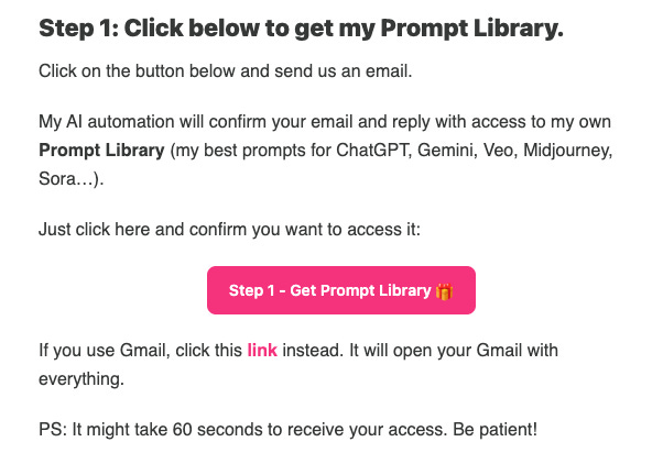
The "send an email to claim your bonus" mechanic is clever. To get the prompt library, you click a button that auto-generates an email from your inbox. Ruben's AI automation confirms your email and sends you the resource. Why does this work? Because it generates a real email reply from a real subscriber, which trains email clients to treat Ruben's address as someone worth delivering to. It's an inbox placement strategy disguised as onboarding. And the animated gifs walking you through inbox setup are a nice touch — visual, scannable, low-effort for the reader.
Comment “Mechanic” to get the automation:
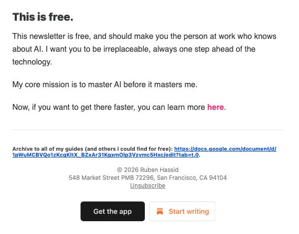
The mission statement lands with the right emotional frame. "my core mission is to master AI before it masters me" — that's a tight, quotable manifesto line. It frames the newsletter as something the reader is doing with Ruben, not for Ruben. It also taps into a real anxiety (being left behind by AI) without being fear-mongering. It's just honest enough to feel real
5 potential improvements:
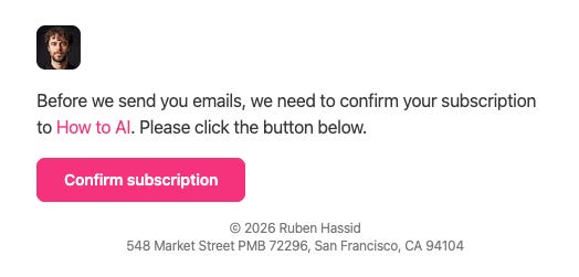
The subscription confirmation double-opt-in is costing him free subscribers. This is the biggest structural problem in the whole funnel. Ruben uses a double opt-in confirmation — before the welcome email, subscribers are asked to confirm their subscription by clicking a button. Double opt-in kills 20–30% of free subscribers who simply don’t bother clicking. For a newsletter at Ruben’s scale, that’s a material number of lost readers every week. The fix is to turn off double opt-in and run a re-engagement campaign instead to clean the list of inactive subscribers over time. He gets a cleaner list either way — but the second path lets the subscribers in first.
No preview text on the welcome email. The subject line reads “your free prompt library is ready” — decent, benefit-forward, clear. But the preview text? absent. Nothing. That means whatever text appears first in the email body gets pulled in as the preview, which is almost always awkward. Preview text is 40–60 characters of free real estate sitting next to the subject line in every inbox on the planet. Not using it is like paying for a billboard and only painting half of it.
No frequency expectations, no next-email tease. The welcome email shares the mission and delivers the resource — but it doesn’t tell the subscriber what happens next. How often do emails arrive? What will the next one be about? This is the moment when a new subscriber is most engaged, most curious, and most likely to look forward to your next email. If you don’t set that expectation, you lose the momentum. A single line at the end — “next week I’ll show you the 3 prompts I use every single morning” — would be enough. Right now there’s just... silence.
No authority statement at the top of the email. The email opens with “hello from Tel Aviv, it’s Ruben :)” — friendly, sure. But if you don’t already know who Ruben is, that line gives you zero reason to keep reading. Nicolas Cole does the same thing. Most big creators do, because they’ve been big long enough to forget what it feels like to be a stranger in someone’s inbox. The fix is simple: one credibility line right after the hello. Something like “I’ve helped 610,000 people actually use AI at work — not just talk about it.” Now I know why I should listen. Without it, the welcome email is just a friendly message from someone I’ve never met asking me to do three things.
The 3-step onboarding flow is clever in theory, exhausting in practice. The mechanic is smart: click to claim your prompt library, move the email to your primary inbox, and add Ruben to your contacts. Each step has a real strategic reason behind it — deliverability, inbox placement, sender reputation. But from the subscriber’s side, it feels like homework. You just signed up for a free newsletter, and now you’re being asked to complete three tasks before you get the thing you came for. Most people won’t do all three. Some won’t do any. The fix isn’t to scrap the mechanic — it’s to reframe it. Instead of “follow these 3 steps,” lead with the reward: “your prompt library is one click away — and while you’re at it, here’s how to make sure my emails don’t disappear into your spam folder forever.” Same steps. Feels like a favor, not a form.
Overall score: 6/10
The mechanics and personality are there, but the double opt-in and missing preview text are quiet conversion killers that compound at scale.
Let’s Recap
Tactics Worth Stealing from Ruben:
The honesty-first free tier framing. Actively telling visitors they don’t have to pay — before pitching why they should — is counterintuitive and incredibly effective. Try this on your own landing page.
Stacking a concrete dollar value against your paid price. Ruben’s “$219 in tools for $200/year” math is almost insultingly obvious once you see it. If your offer includes resources, tools, or bonuses with a real market value, put the number on the page.
The email-to-claim mechanic for inbox placement. Getting subscribers to email you to unlock a resource is a brilliant way to train their inbox algorithm. It’s a deliverability strategy that feels like value delivery.
Potential Upgrades He Could Make:
Swap the homepage hero post for a pinned conversion post. A dedicated “if you’re new here, start here” post designed to convert cold visitors would move his subscription rate meaningfully without changing anything else.
Turn off double opt-in and replace it with a re-engagement sequence. The 20–30% subscriber loss at the confirmation step is a structural leak. Plug it.
Add preview text and a next-email tease to the welcome email. Two small copy additions that would significantly increase open rates on email #2 — which is where the real subscriber relationship starts.
Want To Get the “Send an Email to Claim your Bonus” Mechanic?
This mechanic will help you to
improve your email deliverability,
improve your open rates,
with the improved open rates, you get more sales.
If you want it, comment:
“Mechanic”
I’ll send it over.
Until next time,
David
P.S.: By the way, if you want to generate more money from your funnel, this is exactly what I help people with. DM me “FUNNEL” and let’s get you sorted.